Design systems aren't about buttons — tokens, components, governance
What design systems are actually made of, why a Figma library isn't one, and the governance that keeps everything from falling apart at scale.
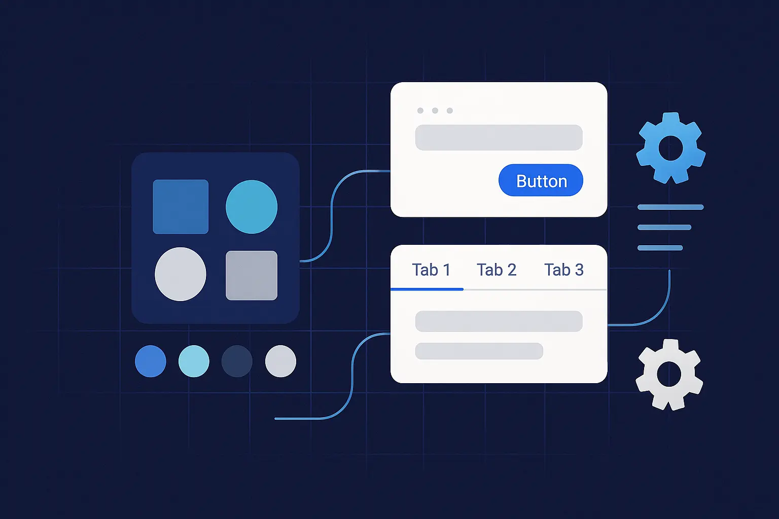
A design system isn't a Figma file with nice components. It's not a style guide PDF. It's the infrastructure that lets your team ship consistent, accessible UI without making the same decisions over and over — and without three designers picking three different blues for the same text.
We've built and maintained systems for clients who outgrew their component libraries within months. The failure pattern is always the same: someone builds a pretty Figma library, nobody writes the governance, and six months later every product team is doing their own thing again. The difference between a design system that sticks and one that gets ignored comes down to three pieces: tokens, components, and governance. Get those right and you have a force multiplier. Skip any one and you have a wiki nobody reads.
What changed in 2025–2026 (and why it matters now)
Two things shifted the design systems landscape in the last year, and both affect how you should build yours.
The DTCG specification hit v1. The W3C Design Tokens Community Group published its first stable specification in October 2025. This matters because tokens finally have a vendor-neutral standard format. The spec uses JSON as its interchange format (.tokens or .tokens.json files), and tools are already shipping support: Figma, Sketch, Penpot, Framer, Style Dictionary v4, Tokens Studio, Supernova, and zeroheight all support or are implementing the standard. If you're starting a token system from scratch in 2026, build on DTCG. If you have an existing system, Style Dictionary v4 includes conversion tools.
The European Accessibility Act started enforcement. As of June 28, 2025, the EAA is actively enforced across all 27 EU member states. French advocacy organizations filed legal notices against major retailers within days of the deadline. Sweden and Denmark began market surveillance by October. Penalties can reach €100,000 or up to 4% of annual revenue depending on the member state. This isn't a future concern — it's a current legal obligation for any digital service sold to EU consumers. Design systems are the single best mechanism for baking accessibility in at the component level so compliance becomes a byproduct of using the system, not a manual audit after the fact.
AI agents are consuming design systems. The third shift is less about regulation and more about opportunity. In 2026, design systems aren't just built for designers and developers — they're built for machines. AI-powered UI generators, code agents, and tools like Figma's generative features need semantic structure, not just visual documentation. If your tokens carry intent (what a component is for, not just what it looks like), AI can generate on-brand, on-system UI without hallucinating your design language. If your system is a static Figma file with no machine-readable structure, it can't participate in this workflow at all.
Design tokens — the API for visual decisions
What they are. Named values that represent design decisions — color, typography, spacing, radii, elevation, motion, breakpoints. Tokens are technology-agnostic: the same source file can output Figma variables, CSS custom properties, Android XML, iOS Swift, or JSON for a design API.
Three tiers, not more. The DTCG spec and industry consensus have settled on three levels. Keep yours clean.
Primitive tokens are raw values. color.blue.500: #2563eb. space.4: 0.5rem. These define the palette. They shouldn't appear directly in component code — they exist so your semantic tokens have something to reference.
Semantic tokens are meaningful aliases. text.primary: {color.blue.700}. surface.elevated: {shadow.md}. These carry intent. When you change your brand color or switch themes, you update primitives and semantics — components don't change.
Component tokens are scoped to a specific element. button.primary.bg. tag.radius. Use these when a component needs values that differ from the semantic defaults — like a button background that doesn't follow the standard surface color.
Naming. Purpose first, then scale or state. text-muted, border-strong, space-6, duration-200. If your naming convention requires a decoder ring, simplify it. Names should be readable by a designer, a developer, and an AI agent.
DTCG-format example
{
  "color": {
    "blue": {
      "500": { "$value": "#2563eb", "$type": "color" },
      "700": { "$value": "#1d4ed8", "$type": "color" }
    }
  },
  "text": {
    "primary": { "$value": "{color.blue.700}", "$type": "color" }
  },
  "radius": {
    "sm": { "$value": "4px", "$type": "dimension" },
    "lg": { "$value": "12px", "$type": "dimension" }
  },
  "space": {
    "4": { "$value": "0.5rem", "$type": "dimension" },
    "6": { "$value": "0.75rem", "$type": "dimension" }
  }
}
CSS output
:root {
  --color-blue-500: #2563eb;
  --color-blue-700: #1d4ed8;
  --text-primary: var(--color-blue-700);
  --radius-sm: 4px;
  --space-6: 0.75rem;
}
What we tell every client: use a limited scale. Don't create a new spacing value for every component. Map tokens to real usage through semantic names so theme switches and brand refreshes are a config change, not a rewrite. Keep the token source in version control and generate platform outputs in CI — manual syncing is where systems die.
Components — production-ready, not just "designed"
A component in a design system isn't a Figma frame you can copy-paste. It's a production-ready UI building block wired to tokens, documented with states and behavior, tested for accessibility, and versioned with a changelog. Anything less is a pattern, not a component.
What "done" means for a component:
Token-wired styles. No hard-coded hex values, no magic numbers. If a color or spacing value appears in component code without referencing a token, it's technical debt that breaks on the first theme switch.
Variants and states documented. Size, emphasis, disabled, loading, error. Every state a user or system can trigger should be visible in the docs and covered in tests.
Accessibility built in. Focus order, ARIA roles, contrast ratios, motion preferences. Since the EAA is now enforced, this isn't a nice-to-have — it's a compliance requirement that your system handles once, at the component level, instead of every product team handling it independently (and inconsistently).
Copy-pastable code for the target stack with tests and usage examples. If a developer has to reverse-engineer usage from the Figma file, adoption will be low.
Changelog entries and migration notes when APIs change. Breaking changes without migration guides create orphaned implementations — and orphaned implementations become the "old design" that haunts your product for years.
Component anatomy example — Button
Parts: container, label, optional leading/trailing icon. Tokens consumed: button.radius, button.padding.x, button.primary.bg, button.primary.text, focus.ring. States: default, hover, active, focus, disabled, loading. Documentation: when to use, when not to use, props and variants table, keyboard behavior, truncation rules, accessibility callouts.
A Button shouldn't know a hex code. It should know it uses text-primary on surface-action with focus-ring at 2px. That separation is what makes theming, localization, and brand refreshes possible without touching component code.
Governance — how changes happen without chaos
The number one reason design systems fail isn't technical. It's organizational. No ownership, no process for changes, no release discipline. We've watched systems get abandoned because "it's too hard to update" — which always means the governance was missing or too heavy.
Three roles, clearly defined. Maintainers own quality, review proposals, and ship releases. Contributors file issues, propose changes, and submit PRs. Consumers use components in products and report gaps. Every person touching the system should know which role they're in.
The operating model we recommend:
Propose. Open an RFC with the problem, use cases, alternatives, and acceptance criteria. No RFC, no work. This prevents the "I built a component nobody asked for" pattern.
Review. Design and engineering review together for accessibility, performance, and API stability. Set an SLA — five business days is reasonable. Reviews that take three weeks kill contributor motivation.
Build. Pair design and code. Add unit tests, visual regression tests, and accessibility checks. Write the docs before you ship, not after.
Release. Use SemVer. Breaking changes require migration notes and deprecation periods. Consumers should never wake up to a broken build because you changed a prop name.
Adopt. Announce changes in a central channel. Track adoption metrics. Support migrations actively — don't just document them and hope.
Automation you want from day one. Linting for token and component API changes. Visual regression tests on PRs. Contrast checks and keyboard-trap detection in CI. Changelog generation from commit messages. If you're not automating these, your maintainers will burn out enforcing them manually.
Metrics that keep you honest. Coverage: percentage of UI using system components. Adoption: active consumers, packages installed, version skew across products. Quality: accessibility issues per release, defect rate, P95 render time. Flow: cycle time from proposal to release, PR review time. If you don't measure these, you can't prove the system is working — and when budget conversations happen, "it feels more consistent" isn't an argument.
AI-readiness — the new table stake
In 2026, design systems serve two audiences: humans and machines. AI code generators, UI builders, and agentic tools need to understand your system's structure, rules, and intent to produce on-brand output. A 60-page "Button Guidelines" PDF doesn't help an AI agent. Structured, machine-readable token files and component metadata do.
If you're building or refactoring a system in 2026, three things make it AI-ready. Semantic token naming that describes purpose, not appearance. Structured component documentation with metadata (when to use, constraints, slot definitions) in a format machines can parse. And defined boundaries — what an AI agent can and can't change — so generated output stays within your brand guardrails without requiring manual review of every screen.
The Model Context Protocol (MCP) is emerging as a way for AI agents to "understand" design systems programmatically. Whether you adopt MCP or another integration pattern, the principle is the same: your system's knowledge should be queryable by tools, not locked in documentation that only humans read.
A 30-day starter plan
Week 1 — Audit and align. Screen-capture 3–5 high-traffic pages. Catalog every duplicate pattern and one-off style. Choose a token toolchain (Style Dictionary v4 with DTCG support is the current default). Agree on naming conventions. Pick two starter components — Button and Input are the classic choices because they appear everywhere and the ROI is immediate.
Week 2 — Tokens in code. Create primitive and semantic tokens in DTCG format. Generate CSS, iOS, and Android outputs from the same source. Wire tokens into Button and Input. Remove every hard-coded color, spacing, and typography value.
Week 3 — Docs, tests, and accessibility. Stand up a docs site — even a well-structured README works to start. Add usage examples, props tables, accessibility notes, and keyboard behavior documentation. Add visual regression tests, contrast checks, and focus-order validation to your CI pipeline.
Week 4 — Governance and release. Write the RFC template, contribution guide, and decision log format. Cut v0.1.0 with a changelog and migration notes. Announce the pilot. Invite one product team to adopt and give structured feedback. Define your metrics dashboard before launch so you can baseline from day one.
The checklist
Before you call it a design system, verify these are true.
Tokens are versioned, generated in CI, and consumed by components — no hex codes in source files. Token format follows the DTCG spec (or has a migration path to it).
Components document anatomy, states, accessibility, and usage — with working code, not just Figma frames.
SemVer, changelog, and migration notes exist for every release.
Visual regression and accessibility tests run on every PR. Contrast, focus order, and keyboard navigation are verified automatically.
An RFC process and decision log exist and are actually used. Changes don't land without review.
A metrics dashboard tracks coverage, adoption, quality, and flow. Someone reviews it monthly.
Accessibility meets WCAG 2.1 AA at minimum — required for EAA compliance if you serve EU customers.
The questions we always get
We only ship web — do we still need tokens? Yes. Tokens give you naming discipline, theming capability, and governance structure even if you never leave CSS. And if you go multi-platform later — or start using AI tools that consume your system — you're already set up.
We have a Figma library. Isn't that a design system? It's a start, but it's about 20% of one. A full system adds code, tests, docs, and change management so that what's in Figma and what's in production are provably the same. Without that, your Figma library is a reference that diverges from reality on the first sprint.
How do we handle themes (light/dark/brand)? Semantic tokens are the switch. Each theme maps the same token names to different primitive values. Components don't change. If you set this up correctly, adding a new theme is a JSON file, not a redesign.
What about the European Accessibility Act? If you sell digital products or services to EU consumers, you're subject to it now. Design systems are your best tool for compliance at scale — bake WCAG 2.1 AA into every component once, and every product team inherits it automatically.
We build design systems that ship — tokens, components, governance, and the CI pipeline to keep everything honest. If your team is outgrowing a Figma library and you want a system that actually holds up, start a conversation.
Sources
- W3C DTCG: Design Tokens specification v1 — first stable version (October 2025)
- Style Dictionary: DTCG format support (v4)
- European Accessibility Act: EAA enforcement and compliance guide
- Supernova: Future of enterprise design systems 2026